

Friday, December 23, 2011

Monday, December 19, 2011
Gypsy Cafe

A little watercolor painting I did for my friends Jim and Mel, proprietors of the incredible Gypsy Cafe in Pittsburgh's South Side neighborhood.
Tuesday, December 13, 2011
Transmetropolitan Art
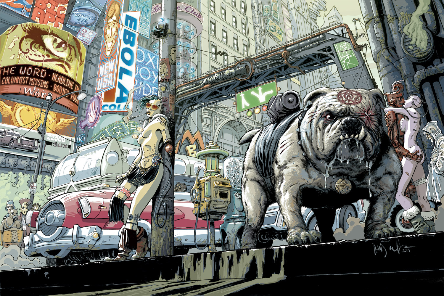 click on the image to see it big!
Way back in January I posted my inks for a two page spread I did for the Transmetropolitan Art Book. I have never posted the finished piece...until now! Proceeds from the sale of the book go towards the Comic Book Legal Defense Fund. And it would make a great gift. I have a copy, and it's a beautiful hard cover book full of amazing art from a wide range of artists. You can purchase it online at the CBLDF site.
Thursday, December 8, 2011



Wednesday, November 9, 2011
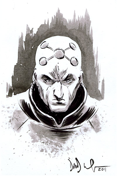
Superman!


I did this a little while ago for a friend. Played around a bit and did a color version too.
Monday, November 7, 2011


Thursday, November 3, 2011
That Hellbound Train: process

The collected edition of That Hellbound Train came out a couple weeks ago. Added to the book are numerous pages of sketches that show my process in creating both the cover for issue 1, as well as some of the interior story pages. I wrote this text originally to accompany those pages. It wasn't included in the book, but I took the time to write it, so I thought I would go ahead and share it:
This is the story of how I draw the pages. Wait, where are you going? No, it's interesting, really. Really? Maybe not. Let's find out together!
First thing's first: research! Ugh, sounds terrible. But actually, it's kind of fascinating. Although it can be time consuming. That Hellbound Train is a period piece, spanning several decades from the Depression-era thirties up to the swinging sixties. Such a period piece, especially one that spans such a large amount of time, requires lots of homework. This is when I get down on my knees and thank the gods of technology for the internet. The magical World Wide Web can be a serious time waster, but in this instance it really streamlines the process. As long as you know how to use it. Every visual aspect of this story had to be researched: clothing, hairstyles, furniture, buildings, automobiles, props, interiors, exteriors, a couple historical figures and, of course, the trains. There are various photo galleries online, and especially for the 1930-40s material, the Library of Congress, (yes, your government) has an amazing array of photographs from all kinds of aspects of everyday life. Even when I'm not working, I just like to look at the stuff.
Next comes the part where I actually start to put together the pages. I sketch rough thumbnail layouts in the computer. I basically am just trying to get a general idea of the panel layouts, blocking and story flow. I set this in the background on a very light opacity, create a new layer and proceed to sketch a more detailed page, all still on the computer. This is where the research comes into play, as well as occasionally some photographs of yours truly taken to portray certain body movements or facial expressions accurately. This phase usually ends up looking like loose pencils, even though I don't actually touch pencil to paper. I print this file out in blue line directly onto the art board, then ink right over it. A lot of the 'drawing', all of the detail work and shading comes in at this stage of the game. When finished, I scan the page back into the computer, I drop out the blue lines, tweak the levels, and my work is done. The pages are sent off for approval and on to the colorist.
That's it for the process. As for my goals, I wanted to convey a classic kind of horror vibe. Something you might see in an old EC comic, or one of the old black and white horror mags of the seventies. It was important to really nail the day to day life, the realism of the characters and setting, so that when the supernatural stuff happens you know it really means something. For me, horror works best when rooted in the real world, when even the most supernatural elements resemble the world we live in, but are askew just enough to make us uncomfortable. Hopefully, that's what I've accomplished here. That's for you to judge.
By the way, there's a reason why you're scratching your head asking "who the hell is this guy?" This is my first work for a larger comic book publisher. It's been a wonderful experience and I hope the guys here at IDW like me enough to offer some more work down the road. Big thanks to our colorist Alfredo for putting up with my notes and bringing the pages to life, to EIC Chris Ryall for taking a chance on me, and the mighty Bobby Curnow, my editor, for spotting my work at San Diego Comicon and for being awesome to work with. Now let's all go to hell.
Monday, October 10, 2011
Sketches from PIX 2011
This past weekend I exhibited at the 2nd annual Pittsburgh Indy Comics Expo, aka PIX. Another really fun show this year. I feel fortunate to have settled in a town that has such a diverse and thriving comics community.
Here are the sketches I did for some fine folks. I took more pics at the show, you can check them out on my facebook or flickr.


Here are the sketches I did for some fine folks. I took more pics at the show, you can check them out on my facebook or flickr.


Tuesday, October 4, 2011
The Question and Batwoman - SuperHero Weekend Charity Auction

This piece is for the upcoming Superhero Weekend art auction, October 29-30 at Comic Fusion in Fleminton, NJ. The event is that weekend at the store, where they will have artists and costumers (and customers) celebrating, but if you're not in the area you can start bidding early online for some amazing art at the silent auction. Check it out!
Wednesday, September 28, 2011


Monday, September 19, 2011

Monday, September 12, 2011
Bedivere: watercolor book cover

This is a book cover illustration I was commissioned to do for my friend Wayne Wise for his novel Bedivere: The King's Right Hand. It's always fun to break out the watercolors. Check out more about it, including how to order the eBook, right here!

Subscribe to:
Posts (Atom)